In comparison to my preliminary task of creating a school website, my main website is more advanced and I feel in many ways is better. The first reason for this is likely to be that as I have created both my websites, my understanding of the conventions and codes that I need to follow had became a lot clearer. Therefore my second website is more conventional and works better, than the first, due to the increasingly knowledge along the way.
Additionally, my skill has also increased, as iWeb was a new programme to me I had little knowledge about using it. When I first started my preliminary site looked quite simple and basic. However by the time that I came round to creating my main website, I felt that it looked more professional than the preliminary due to my increased knowledge. I went back to my preliminary site, to make it more professional, as it looked poor compared to the main site.
Although my sites look reasonably well, it is clear that I am still inexperienced in website design, as not all parts were up to professional standards, I feel that my site works well though as it is similar in layout and style to the other sites that I have looked at. It is clear to see that their has been improvements between my preliminary and main website, which is likely to be due to picking up skills and learning how to use the chosen software.
Tuesday, 20 December 2011
Sunday, 18 December 2011
What have you learned about technologies from the process of constructing this product?
To complete my product I used a Mac computer, and iWeb software. If I had chosen to use a Windows PC I would be unable to use iWeb, as it is software that is only available to Mac. I would have had to find an alternative such as Dream weaver. This was a big advantage of using a Mac computer, as iWeb was very easy to use WYSIWYG (what you see is what you get) software, where as alternatives such as Dream weaver would require knowledge of HTML, which is something, I didn’t know about. I have previously used a Mac, for my magazine project for GCSE Media.
Additionally, I used Photoshop, to edit my images and backgrounds. Photoshop is available to both Mac and Windows computers, so there was no benefit from using the Mac computer. However, I did find that from using the Mac with Photoshop and iWeb is that everything worked very intuitively together. For example I could do a lot of drag and drop between programmes, for example the main image on my homepage, I was able to crop in Photoshop then, drag it directly into iWeb, I was also able to do this with my logo and banner which I made in Photoshop.
I used Final Cut to edit my video that I took using a digital camera. This allowed me to crop out bits that I didn’t need, rather than re-recording the entire video. I hadn’t used Final Cut before but I found it very easy to use, and picked it up very quickly. I also used iCal to create a diary so that I could keep track of deadlines, this was similar to the way that I put dates into the diary on my Blackberry so again I picked it up easily. This helped me greatly as I could see what I needed to do and at what time I needed to do it.
Another piece of technology that was a great help to me was the Internet. I used the Internet to research other websites, so that I could get an understanding of what conventions I needed to follow in order for my site to be successful, For example I looked at four different websites and annotated them. I also used the Internet to download brush packs for Photoshop; I downloaded a brush pack called ‘Paint Splats’ which I used to create my background. Another way in which I used the Internet was to upload pieces of my work onto my blog.
I feel that there were little limitations for me with the technology I used, as it was all fairly easy to use, and I could complete all tasks I wanted to do with it. The only problem I encountered was with the built in layouts on iWeb, as they all looked like they had been laid out and caused my website to lack uniqueness, I had to work hard to prevent my website looking like it followed these templates.
Friday, 16 December 2011
How did you attract/address your audience?
Attracting and addressing my audience was one of the most important parts of my site, as if the site is not attracting and doesn’t address the audience they would be unlikely to use the information and advice. There is many ways that I attracted and addressed the audience and kept them engaged.
Firstly I used a bright coloured background, made up of green, pink, blue, white, yellow and orange. This would appeal to the audience as it is not dull and boring like the other websites that I looked at, bright colours are also usually associated with fun, and I wanted to represent my audience, as these are people that have fun regularly. The connotation of fun also takes the seriousness away from sexual health, and makes it seem that it is something that everyone worries about, and everyone can associate with. It makes the text look less plain as it is not on just a plain background, and makes the audience more likely to read and pay attention to all the information rather than just reading over it briefly.
Additionally, the typography on the page uses different sizes, so that the information is easier to read, than very small tiny writing that would disappear amongst the pictures included on the page. The typography is the main source of information on the page, as the pictures are mainly used to separate the information, so it is important that the typography stands out. I used mostly basic words that would appeal to the wider demographic so that they would understand what was meant and not loose interest, although the correct medical terms were used when needed to maintain an aspect of professionalism.
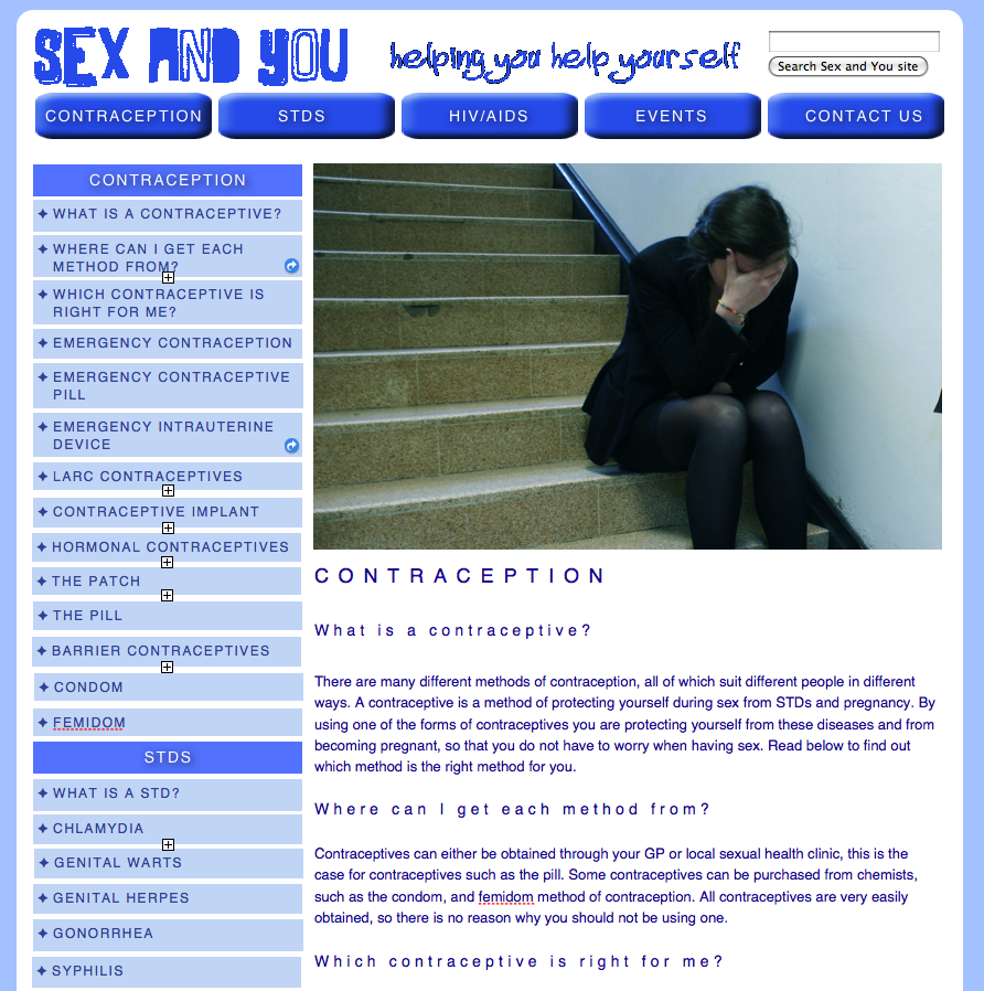
The words were positioned on the page amongst pictures so that they were less bulky and helped to break them down and could be taken in better. The pictures used could attract the audience as they showed people having fun, and added a less serious side to sexual health. One serious photo was used to reinforce the idea, that you must be careful. This photo was made to represent a child talking to their parent about sexual health.
I feel that my site does attract and address the audience, as it is very interesting and relaxed, however I feel that the text on the page could be separated up so that it is in bullet points or chunks, so that the audience can engage with it better.
Firstly I used a bright coloured background, made up of green, pink, blue, white, yellow and orange. This would appeal to the audience as it is not dull and boring like the other websites that I looked at, bright colours are also usually associated with fun, and I wanted to represent my audience, as these are people that have fun regularly. The connotation of fun also takes the seriousness away from sexual health, and makes it seem that it is something that everyone worries about, and everyone can associate with. It makes the text look less plain as it is not on just a plain background, and makes the audience more likely to read and pay attention to all the information rather than just reading over it briefly.
Additionally, the typography on the page uses different sizes, so that the information is easier to read, than very small tiny writing that would disappear amongst the pictures included on the page. The typography is the main source of information on the page, as the pictures are mainly used to separate the information, so it is important that the typography stands out. I used mostly basic words that would appeal to the wider demographic so that they would understand what was meant and not loose interest, although the correct medical terms were used when needed to maintain an aspect of professionalism.
The words were positioned on the page amongst pictures so that they were less bulky and helped to break them down and could be taken in better. The pictures used could attract the audience as they showed people having fun, and added a less serious side to sexual health. One serious photo was used to reinforce the idea, that you must be careful. This photo was made to represent a child talking to their parent about sexual health.
I feel that my site does attract and address the audience, as it is very interesting and relaxed, however I feel that the text on the page could be separated up so that it is in bullet points or chunks, so that the audience can engage with it better.
Wednesday, 14 December 2011
Who would be the audience for your media product?
The audience for my media product would be young adults and teenagers, between the ages of 14-24, which was discovered through asking the people who completed my surveys age. I found the social classes to be A, B, C1 and C2 as although the information is adapted for younger people, the information is suitable for everyone. The target audience would be people who support online campaigns as opposed to face-to-face campaigns, such as visiting a clinic; this was again discovered through my survey.
The target audience would be very sociable people, as when asked ‘what do you mostly use the internet for’, 67% used the Internet for socializing. This suits the representation present on the website of the people being very hedonistic, and always seeking a good time with their friends.
I also found that my audience would be most likely to confide in a friend, (70%), again supporting the idea that they are hedonistic as they are always out with their friends and that they have a very close social friendship group.
Additionally, from my own observation I found that my audience would be people who are worried about their sexual health and seeking reassurance without being caused to have unnecessary panic by convincing the person that they have something they don’t. The information on my website is very calming, and tries to offer ways to protect and prevent and further ways to reassure yourself if you’re still worried, by visiting a clinic/doctor, this is suited to the audience as it provides them with what they want to see and hear.
In conclusion, my target audience would be people that are interested in having a good time, but also want to be safe. I found the people to not want to be ordered what to do, but rather suggested ways in which they can feel at ease and be helped.
Tuesday, 13 December 2011
What kind of media institution might distribute your media product and why?
As my media product is an online campaign, it would be distributed online via a computer. In my early stages of research I researched into web hosting, and domain name registration, these are needed to distribute my website so it was important that I researched them. There are many different types of web hosting online, when researching I found a cheap hosting server that I would like to use to distribute my product, www.justhost.com. This had suitable facilities and was very affordable as prices started as cheap as £1.95.
After considering a using a free host website to distribute my media product, I decided that I would use a paid host due to the services offered were greater than that of a free host, and means that I would be able to include greater amounts of information, such as videos, images, and text, for just a small fee once a month.
This fee would entitle me to use a space on the server, which would distribute my website to the world wide web (Www). However before my website would be accessible I would need to purchase a domain name. I looked at many different websites that sell domain names, the prices ranged depending on the website, and the ending, for example, if the website is .com or .co.uk or .net.
Therefore, by purchasing a domain name, and web hosting, I would be able to upload my website to the Internet, and distribute it to other Internet users within my target audience. The internet is the fastest growing form of communication, so if I did choose to distribute my media product through this institution it would be more likely to be successful than if it were through a newspaper or magazine.
Saturday, 10 December 2011
How does your media product represent particular social groups?
The media product that I have created represents a demographic that is between the teenage and young adults age range, roughly around 14-24 years old. Within this demographic, the social classes represented are A, B, C1 and C2. Additionally, both genders are approached, as are all sexualities within this demographic. Different ethnicities are represented, which is something I have found on similar sites that I have looked at.
The way that my site has been constructed reflects who the people are that will benefit most from my site. This is done through the approach taken. A non-authoritarian mode of address is taken, which makes the audience feel at ease with the site and as if it is trying to help and not tell them that what there doing is wrong. This gives the feel that the people giving information on the site are more like a friend, than a parent figure, which is very important considering only 13% of people surveyed would confide in a parent with regards to sexual health. On the main page to my site, it says ‘sexual activity is common at almost every stage of life’. This makes the audience feel as if it is normal, and that there not wrong for doing so. This would appeal to the particular social group as they can relate to it, and it gives them the help they need in the way that the majority of them would want it.
Additionally the photographs used represent hedonistic teenagers and young adults, as one picture shows two teenage girls at a party drinking, a situation that can be related to by the audience. Again representing the particular social group, who are having a good time and do not want to be told what they’re doing is wrong, but just want help on how to say safe. The photographs on the contraception page are also very non-authoritarian, as they show ways in which to keep safe, whilst still doing what you want to do.
Unlike some other websites, that show pictures of what can happen if you don’t stay safe, that both shock and scare the audience as the image makes them not want it to happen to them, the approach taken makes them realise how easy it is to stay safe, and prevent any STDs.
The language used is also very representative of the particular social group as it is informal, although medical terms are used when necessary, this again appeals to them as informal language can be seen by the particular group as a put off.
In conclusion I feel that my media product represents particular social groups, through the language, images, approach taken, and consideration for different ethnicities and sexualities.
Friday, 9 December 2011
In what ways does your media product use, develop or challenge forms and conventions of real media products?
The website that I have created offers help on people worried about or suffering from STD’s. It was important that the site was conventional and appropriate to the situation. I feel that my site develops a lot of forms and conventions, but also challenges many.
Firstly, content wise, my website is very conventional, information is offered on how to get help and what to do, additionally more detailed information is offered on each of the individual diseases focused on. This is similar for the majority of other sites that I have looked at. Additionally, a clinic finder is offered on my site, this is a tool that I have seen on a few other websites that I looked at, so I believed it to be useful and included it.
Furthermore, a page is included on how to stay safe and protect yourself, offering various information on forms of contraception. Again, a majority of the other STD sites used this. As my website is a charity website, it would rely heavily on donations to continue running. Due to this reason, most of the other charity websites included a donation link/banner, which they could click and then proceed to donate to the website to help it continue running, I followed this convention and included a option to donate via Pay Pal.
On the other hand, in many ways my site challenges some of the conventions of a sexual health website. The sexual health websites all had a very plain, neutral colour scheme, whereas my site had a black background with various different brightly coloured ‘paint splats’ on it, which was created through Adobe Photoshop. This challenged the convention of a neutral colour scheme, however I feel that the background I chose is more appropriate as we have a much younger target audience, so it is appealing.
Additionally, the layout is slightly unconventional as we included a ‘click to enter’ page, where you click the condom to proceed. This was something that I did not see on the other sites that I looked at. Additionally the pages on our website included a lot more pictures, and less writing than the ones I looked at, however I feel that this makes the page more interesting for the audience.
In conclusion several of the conventions are followed, so that the site is appropriate however the layout and similar conventions were challenged to give a young feel to the site, so that it is more interesting for the target audience of teenagers and young adults.
Wednesday, 7 December 2011
Main Site
This is my final main site, Sex and You which I am very pleased with. Below are the screenshots of every page on my main site.


Tuesday, 6 December 2011


Friday, 2 December 2011
Development to Site
We decided to change our website which we felt looked unprofessional. This is what the website looked like before we made these changes. The bright background seemed to overpower the text, and would make the audience lose focus on the important information.


We decided to tone down the background so it was more plain as it would look more professional and simple, and the text would stand out more. I feel the decision we made helped to improve the website and make it look more suitable.
This is the site once we had made changes to it:

Thursday, 1 December 2011
Film
This is the video that we have created for our Get Invovled Page, this is to advertise charity events that have been arranged by 'Sex and You'. This will help to broaden the campaign of our website. I feel our video works well as it gives a sense of campaign to our charity site.
Tuesday, 29 November 2011


Sunday, 27 November 2011
Banner
I created a banner to include on my website. I did this through photoshop, and felt that it would help to promote the 'Stay Safe' message. The first banner I did was just a black banner with blue text saying 'Stay safe'.

The second banner I created was using the original banner but included a yellow paint splat, I chose not too use the one with paint splat because the background had already used paint splats and I felt that it became too much.


The second banner I created was using the original banner but included a yellow paint splat, I chose not too use the one with paint splat because the background had already used paint splats and I felt that it became too much.

Friday, 25 November 2011
Background Design.
I wanted a background that was bright and appealing to my audience, as I felt that the layouts, background and colour schemes were very dull on the other websites that I looked at. I chose to challenge this convention as this would make my site more appealing and give me a potential advantage over these other sites.
I created this background using Photoshop. I downloaded a pack called 'Paint Splats' and added different colour 'splats' onto a black background.

I created this background using Photoshop. I downloaded a pack called 'Paint Splats' and added different colour 'splats' onto a black background.

Wednesday, 23 November 2011
'Sex and You' Title.
This is the site title that I created for my website. I created this using Photoshop and feel that the font style is very appealing to my target audience, as is the colour as it is not very gender specific and can appeal to a wide range of people.


Monday, 21 November 2011
Main Site Sketches
After planning and making my preliminary site, it was now time to begin development on my main site, I planned my main site before I began work on it, so that I knew what I was doing and how to lay everything out. Below are the sketches that I drew for my site.


Saturday, 19 November 2011
Preliminary Site Sketches
Now it was time to make the preliminary site, I sketched out my preliminary site before I made it, so that I had an idea of what I was creating, and how I was laying everything out.
Main Page:

Media Page:

Main Page:

Media Page:

Friday, 11 November 2011
Survey Findings
These are my findings that I have found from conducting my survey.
Thirty people were surveyed. The ages of which were between 14-24, with the majority between 16 and 18. This therefore gives me a target audience of mainly teenagers, as only two of the thirty surveyed were in their twenties.
The results for gender showed that around 65% of people who took the survey were female, with just 35% being male. Additionally, the ethnicity results showed a majority of White Biritsh, which was around 60%, with the other 40% being made up of various ethnicities, White European, Asian, Mixed and African.
A majority of people (66.7%) use the internet mainly for socialising, on sites such as Facebook, Myspace etc. The second most popular reason for mainly using the internet was listening to music (16.7%), followed by Research/Homework (13.3%). With just 1 out of 30 (3.3%) using the internet mainly to watch videos. This suggests that advertising on sites such as Facebook and other social networking sites would be the best place to raise awareness for my campaign.
I also found that most people use the internet for between 10-14hours a week, a large proportion also used it for 15+hours a week. Out of the 30 surveyed, 17 have previously visited a charity/campaign website, and 13 hadn't. Additionally only 14 of the 17 answered the question "What campaign/charity site in particular has stood out to you?" Most answered Cancer Research or NSPCC.
More people were unsure or disagreed with the statement that they regularly give to charity, than agreed with it. Suggesting that not everyone is likely to donate to charity, or the people were unsure because it depends on the sentiment of the charity to them.
Around 63% of people were more likely to support a charity if it was face to face, as opposed to online. When asked to rate the likeliness of the person visiting a sexual health awareness campaign, with 1 being the likeliest and 5 being the unlikeliest, the average rating was 3, however the majority voted for 2. Of those surveyed 70% of people would confide in a friend if they had a problem regarding sexual health, 17% would confide in a doctor, 13% a parent, and none with a teacher.
Shockingly, 60% answered "haven't really looked" when asked if they feel their is enough information available online about staying healthy sexually. Out of the rest, 30% felt that there is enough information, and just 10% felt that there isn't enough.
Graphs Displaying some Results:
What do you mostly use the internet for?

How many hours per week do you spend online?

Would you be more likely to support a campaign if it was...

Wednesday, 9 November 2011
Internet Usage Survey
I have created a survey to find out how my target audience use the internet. I used surveymonkey.com to do this, and plan to email this survey to 30 people for feedback. Below is the survey that I have created, consisting of ten questions. This feedback that I receive will help me to improve and work on my ideas.


Sunday, 6 November 2011
Target Audience
The website that I will be designing will have a wide demographic and will be mainly aimed at people between the ages of 14 and 24. From my survey that I conducted I found that the people most likely to visit a Sexual Health Campaign website were between these ages. The main purpose of my website is to inform people on how to stay healthy sexually, and offer information on how to seek help, and what to look out for. It is important that I make my website accessible and appeal to my target audience otherwise they would be unlikely to visit.
As my website is a charity website, it relies largely on donations to keep itself running. A target audience of 14-24 is very suitable for receiving donations as people in this age bracket would be earning and would therefore be likely to have a reasonable income, some of which they would donate for a special cause.
Although my website is looking for donations, it is also trying to achieve its main purpose which is to help people. Therefore my target audience would be social classes A, B, C1 and C2, as the help offered would be adapted so that it is suitable for everyone. The target audience will also most likely be students, at either school or university and also people in employment.
People within this group of 14-24 year olds would be a variety of ethnicities as sexual health could be an issue to anyone, so it is important that I ensure my information is suitable for all ethnicities and that there is a balanced representation of this within my website.
As sexual health, for some, can be a very boring issue, I will work hard to make sure that my site is appealing for my entire target audience, so that they read the information and are likely to revisit my charity if they have an issue with their sexual health. I will try and achieve this by using different colours, and presenting the information in a simple and easy way to read, but I will also make it interesting to engage the wide demographic.
Saturday, 5 November 2011
Research into Web Hosting and Domain Name Registration
Once a website has been created, it is important to think about how it will be distributed and reach the target audience. To get a website running properly you have to use web domain and web hosting. I found out that it was important to research into web hosting and web domain, as it allowed me to get a better understanding, and also to find the correct web host and web domain that is suited best to my requirements.
What is web hosting?
I researched into web hosting, as I would need a web host to host my website. Web hosting allows individuals and organisations to make their website accessible via the World Wide Web (www). Web hosts provide a space on their server usually for a fee, which provides the website with internet connectivity, allowing people to access the site, and the pages and information on it via the web hosts server. There are many different types of web hosting servers ranging from free hosting to high end hosting servers offering a large amount of space on the server for a cost.
I took a look at some of the different web hosts that were on offer, and the cost of each. I feel that I would go for a mid-priced host, but not a free host, or a very expensive host. This is because for my charity organisation, spending lots of money on an expensive host would be unnecessary and not beneficial to the organisation. Additionally a free web host would mean that there would be a lack of functions that the website can do, as opposed to a web host that costs. One particular host that stood out to me while researching was www.justhost.com which offers web hosting from £1.95 a month, an offer price compared to the usual £4.95. I feel that this website offered very cheap hosting but also had lots of different functions available; this would be the web host that I would use for my site.
What is a domain name?
A domain name is also needed for the website; the domain name is the web address, usually ending in .co.uk or .com. The web domain is an extra cost, and is usually offered by the web host that you are using. The web domain can be used with your web host, providing that no one is already using your chosen domain, and people can then access your site by typing in your domain, and they will be took straight there.
Wednesday, 2 November 2011
Website Research Findings
I found many conventions when researching into different campaign websites, this helped me greatly. One of the main conventions I found on all sites was the formal approach taken. As the campaigns are all looking at sexual health, which is a serious issue, they have a very formal tone, using few different colours together creating an overall plain and neutral website. I felt that this tone and colour scheme convention would work well for my website so I decided to stick to this and follow it.
Another convention that I found them all to follow is the inclusion of images of doctors on the homepage, this adds to the professionalism and helps to reassure the audience that their problems can be solved by visiting their local friendly GP, I feel it is important to include this in my site when we begin to make it, as it helps to reassure the audience.
Most of the websites also include a list of different STD's with sub-pages for each so that you can read about the disease, the treatment and also look up symptoms. I feel this is very important to include as it would be one of the main reasons for the audience to visit and look at our website. The sites are constructed to represent all ethnicites, sexualities, genders and people of all ages, this is so that the campaign can help everyone, although there are some, which I didn't look at that are targeted for teen sexual health.
In conclusion there are many conventions, which I intend to follow to create a conventional sexual health campaign which will be able to benefit many.
Monday, 31 October 2011
Research Into Other Websites
I researched into other websites, so that I can get an understanding of the conventions of a charity website, which I will try and stick to whilst making my website. I researched four different STD campaign websites, I looked at three home pages, and one page within a campaign website. Below are print screens of the websites with annotations of what I found. I found this to be very helpful and I now have a clear idea and picture of what I need to stick to and include in my website.


Saturday, 29 October 2011
Brief
I will be designing a charity website to help people stay healthy sexually.I have a target audience of teenagers and young adults, but would offer help for everyone. It is important how I lay out my site as it has to be aesthetically appealing to my target audience so that it is simple and interesting for them to read as the site will need to keep interest so people take on the advice offered.
As I am working alone, I must create a minimum of 4 pages for my website. These pages will be pages such as, Prevention, Seeking Help, Information on STD's, Contact Us and FAQ's. These pages will contain easy, simple to read information aimed at my target audience.
I took influence for my website from sites such as YPSH, The Young People's Sexual Health site (ypsh.net) as the layout was very original, simple and made the site interesting for people to read. To create my site, I will be using iWeb on Mac, and will also be using Photo Shop to edit the pictures that I take and to make fonts for my titles, writing and buttons. I will also use video editing software to make a video for my site.
To complete my project I will also need to purchase a domain name, and also sign up with a web host. I will need to research further into domain name registration and web hosting before I choose as I currently do not know a lot about it.
I will also post regular diary updates so that the progress of my site can be tracked.
Tuesday, 25 October 2011
Welcome
Welcome to my AS Media blog, on here I will post all of my AS Coursework which I will be doing over the next few months. I took media as a GCSE option and enjoyed it so continued the subject for AS.I hope to get a minimum of a B for AS.
Subscribe to:
Posts (Atom)