As my media product is an online campaign, it would be distributed online via a computer. In my early stages of research I researched into web hosting, and domain name registration, these are needed to distribute my website so it was important that I researched them. There are many different types of web hosting online, when researching I found a cheap hosting server that I would like to use to distribute my product, www.justhost.com. This had suitable facilities and was very affordable as prices started as cheap as £1.95.
After considering a using a free host website to distribute my media product, I decided that I would use a paid host due to the services offered were greater than that of a free host, and means that I would be able to include greater amounts of information, such as videos, images, and text, for just a small fee once a month.
This fee would entitle me to use a space on the server, which would distribute my website to the world wide web (Www). However before my website would be accessible I would need to purchase a domain name. I looked at many different websites that sell domain names, the prices ranged depending on the website, and the ending, for example, if the website is .com or .co.uk or .net.
Therefore, by purchasing a domain name, and web hosting, I would be able to upload my website to the Internet, and distribute it to other Internet users within my target audience. The internet is the fastest growing form of communication, so if I did choose to distribute my media product through this institution it would be more likely to be successful than if it were through a newspaper or magazine.
Tuesday, 13 December 2011

Saturday, 10 December 2011
How does your media product represent particular social groups?
The media product that I have created represents a demographic that is between the teenage and young adults age range, roughly around 14-24 years old. Within this demographic, the social classes represented are A, B, C1 and C2. Additionally, both genders are approached, as are all sexualities within this demographic. Different ethnicities are represented, which is something I have found on similar sites that I have looked at.
The way that my site has been constructed reflects who the people are that will benefit most from my site. This is done through the approach taken. A non-authoritarian mode of address is taken, which makes the audience feel at ease with the site and as if it is trying to help and not tell them that what there doing is wrong. This gives the feel that the people giving information on the site are more like a friend, than a parent figure, which is very important considering only 13% of people surveyed would confide in a parent with regards to sexual health. On the main page to my site, it says ‘sexual activity is common at almost every stage of life’. This makes the audience feel as if it is normal, and that there not wrong for doing so. This would appeal to the particular social group as they can relate to it, and it gives them the help they need in the way that the majority of them would want it.
Additionally the photographs used represent hedonistic teenagers and young adults, as one picture shows two teenage girls at a party drinking, a situation that can be related to by the audience. Again representing the particular social group, who are having a good time and do not want to be told what they’re doing is wrong, but just want help on how to say safe. The photographs on the contraception page are also very non-authoritarian, as they show ways in which to keep safe, whilst still doing what you want to do.
Unlike some other websites, that show pictures of what can happen if you don’t stay safe, that both shock and scare the audience as the image makes them not want it to happen to them, the approach taken makes them realise how easy it is to stay safe, and prevent any STDs.
The language used is also very representative of the particular social group as it is informal, although medical terms are used when necessary, this again appeals to them as informal language can be seen by the particular group as a put off.
In conclusion I feel that my media product represents particular social groups, through the language, images, approach taken, and consideration for different ethnicities and sexualities.
The way that my site has been constructed reflects who the people are that will benefit most from my site. This is done through the approach taken. A non-authoritarian mode of address is taken, which makes the audience feel at ease with the site and as if it is trying to help and not tell them that what there doing is wrong. This gives the feel that the people giving information on the site are more like a friend, than a parent figure, which is very important considering only 13% of people surveyed would confide in a parent with regards to sexual health. On the main page to my site, it says ‘sexual activity is common at almost every stage of life’. This makes the audience feel as if it is normal, and that there not wrong for doing so. This would appeal to the particular social group as they can relate to it, and it gives them the help they need in the way that the majority of them would want it.
Additionally the photographs used represent hedonistic teenagers and young adults, as one picture shows two teenage girls at a party drinking, a situation that can be related to by the audience. Again representing the particular social group, who are having a good time and do not want to be told what they’re doing is wrong, but just want help on how to say safe. The photographs on the contraception page are also very non-authoritarian, as they show ways in which to keep safe, whilst still doing what you want to do.
Unlike some other websites, that show pictures of what can happen if you don’t stay safe, that both shock and scare the audience as the image makes them not want it to happen to them, the approach taken makes them realise how easy it is to stay safe, and prevent any STDs.
The language used is also very representative of the particular social group as it is informal, although medical terms are used when necessary, this again appeals to them as informal language can be seen by the particular group as a put off.
In conclusion I feel that my media product represents particular social groups, through the language, images, approach taken, and consideration for different ethnicities and sexualities.
Friday, 9 December 2011
In what ways does your media product use, develop or challenge forms and conventions of real media products?
The website that I have created offers help on people worried about or suffering from STD’s. It was important that the site was conventional and appropriate to the situation. I feel that my site develops a lot of forms and conventions, but also challenges many.
Firstly, content wise, my website is very conventional, information is offered on how to get help and what to do, additionally more detailed information is offered on each of the individual diseases focused on. This is similar for the majority of other sites that I have looked at. Additionally, a clinic finder is offered on my site, this is a tool that I have seen on a few other websites that I looked at, so I believed it to be useful and included it.
Furthermore, a page is included on how to stay safe and protect yourself, offering various information on forms of contraception. Again, a majority of the other STD sites used this. As my website is a charity website, it would rely heavily on donations to continue running. Due to this reason, most of the other charity websites included a donation link/banner, which they could click and then proceed to donate to the website to help it continue running, I followed this convention and included a option to donate via Pay Pal.
On the other hand, in many ways my site challenges some of the conventions of a sexual health website. The sexual health websites all had a very plain, neutral colour scheme, whereas my site had a black background with various different brightly coloured ‘paint splats’ on it, which was created through Adobe Photoshop. This challenged the convention of a neutral colour scheme, however I feel that the background I chose is more appropriate as we have a much younger target audience, so it is appealing.
Additionally, the layout is slightly unconventional as we included a ‘click to enter’ page, where you click the condom to proceed. This was something that I did not see on the other sites that I looked at. Additionally the pages on our website included a lot more pictures, and less writing than the ones I looked at, however I feel that this makes the page more interesting for the audience.
In conclusion several of the conventions are followed, so that the site is appropriate however the layout and similar conventions were challenged to give a young feel to the site, so that it is more interesting for the target audience of teenagers and young adults.
Firstly, content wise, my website is very conventional, information is offered on how to get help and what to do, additionally more detailed information is offered on each of the individual diseases focused on. This is similar for the majority of other sites that I have looked at. Additionally, a clinic finder is offered on my site, this is a tool that I have seen on a few other websites that I looked at, so I believed it to be useful and included it.
Furthermore, a page is included on how to stay safe and protect yourself, offering various information on forms of contraception. Again, a majority of the other STD sites used this. As my website is a charity website, it would rely heavily on donations to continue running. Due to this reason, most of the other charity websites included a donation link/banner, which they could click and then proceed to donate to the website to help it continue running, I followed this convention and included a option to donate via Pay Pal.
On the other hand, in many ways my site challenges some of the conventions of a sexual health website. The sexual health websites all had a very plain, neutral colour scheme, whereas my site had a black background with various different brightly coloured ‘paint splats’ on it, which was created through Adobe Photoshop. This challenged the convention of a neutral colour scheme, however I feel that the background I chose is more appropriate as we have a much younger target audience, so it is appealing.
Additionally, the layout is slightly unconventional as we included a ‘click to enter’ page, where you click the condom to proceed. This was something that I did not see on the other sites that I looked at. Additionally the pages on our website included a lot more pictures, and less writing than the ones I looked at, however I feel that this makes the page more interesting for the audience.
In conclusion several of the conventions are followed, so that the site is appropriate however the layout and similar conventions were challenged to give a young feel to the site, so that it is more interesting for the target audience of teenagers and young adults.
Wednesday, 7 December 2011
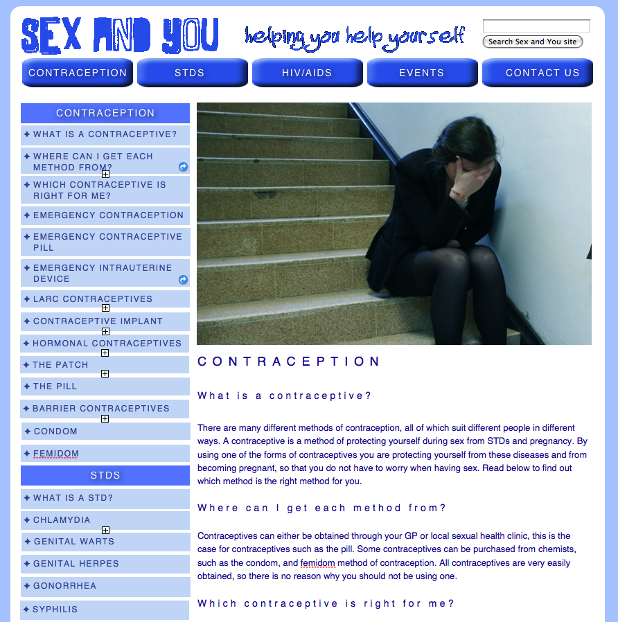
Main Site
This is my final main site, Sex and You which I am very pleased with. Below are the screenshots of every page on my main site.




Tuesday, 6 December 2011


Friday, 2 December 2011
Development to Site
We decided to change our website which we felt looked unprofessional. This is what the website looked like before we made these changes. The bright background seemed to overpower the text, and would make the audience lose focus on the important information.


We decided to tone down the background so it was more plain as it would look more professional and simple, and the text would stand out more. I feel the decision we made helped to improve the website and make it look more suitable.
This is the site once we had made changes to it:

Thursday, 1 December 2011
Film
This is the video that we have created for our Get Invovled Page, this is to advertise charity events that have been arranged by 'Sex and You'. This will help to broaden the campaign of our website. I feel our video works well as it gives a sense of campaign to our charity site.
Subscribe to:
Posts (Atom)